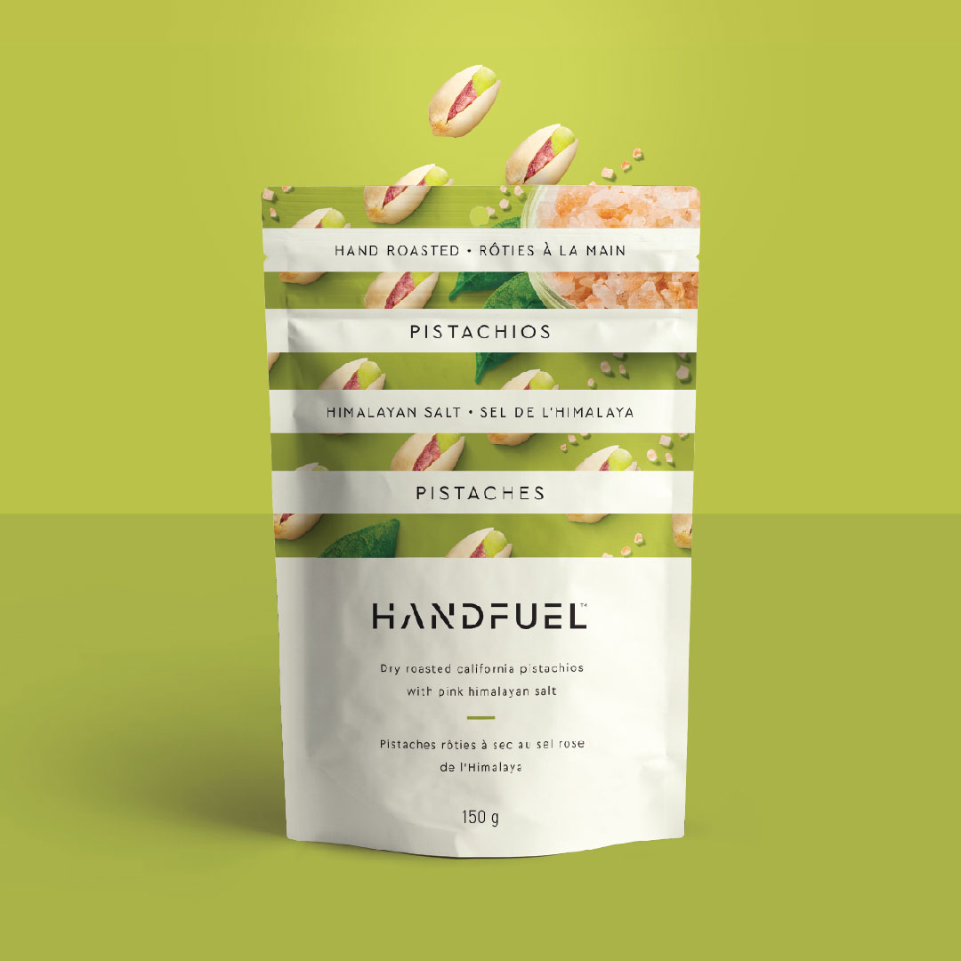
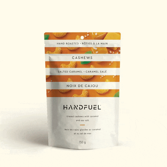
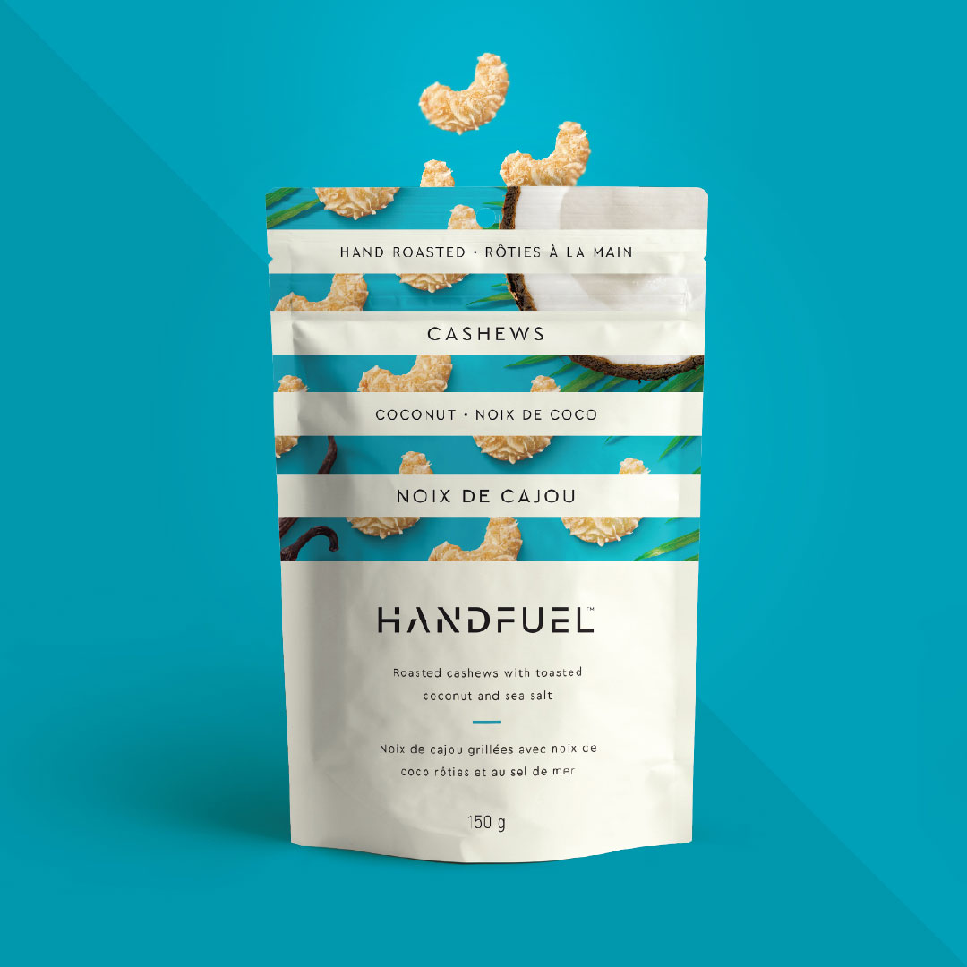
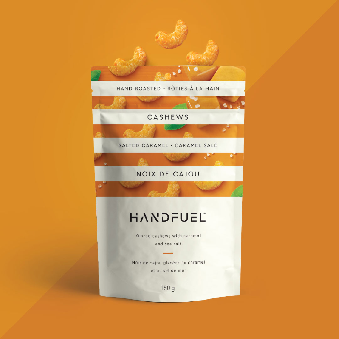
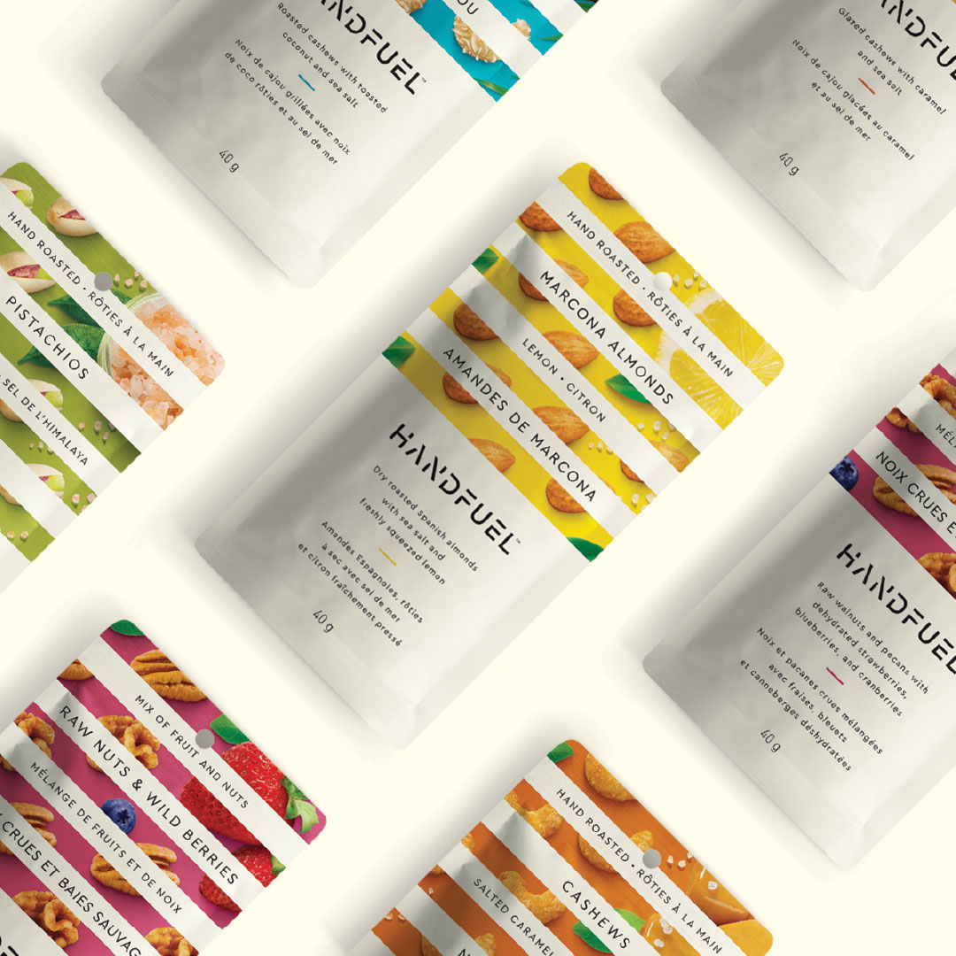
Handfuel
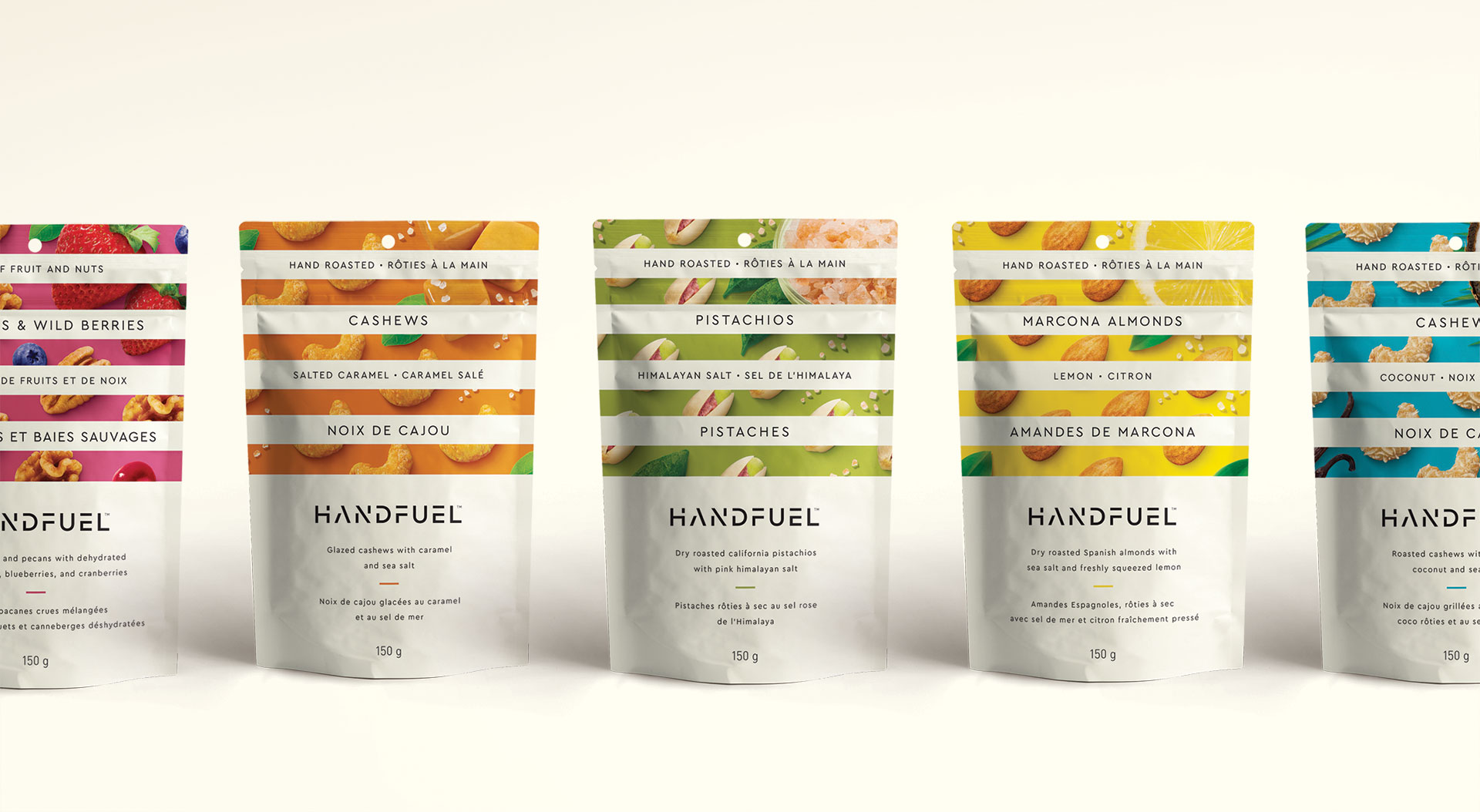
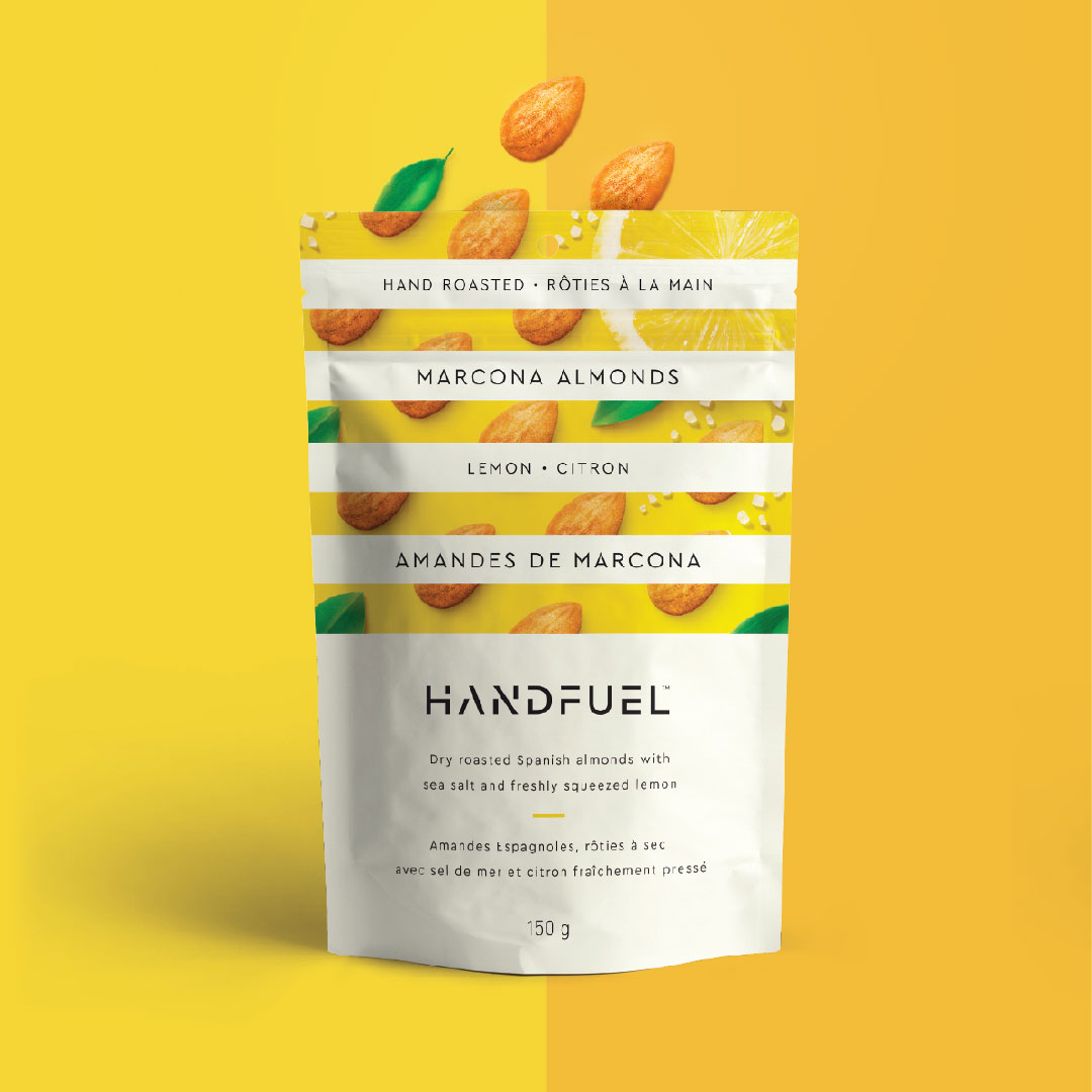
When HANDFUEL told us they made healthy nut-based snacks that were also over-the-top delicious, we thought they were lying. Then we tried them. The flavours were so incredible we could hardly believe it. We had to find a way to communicate HANDFUEL’s unique selling feature and translate that difference on shelf. So we found the sweet spot between taste appeal and health consciousness and broke away from convention with a strong graphic language that’s recognizable from a distance and appetizing up close.
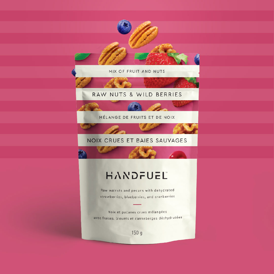
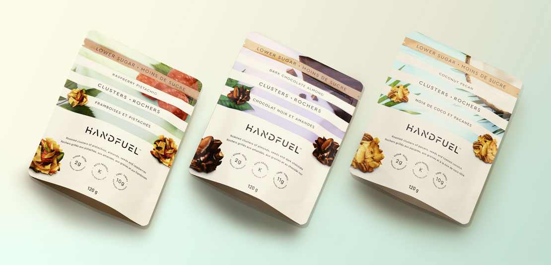
Handfuel Clusters
As with Nuts, these Clusters needed to differentiate from competition. We were challenged to leverage their current successful brand visuals and personality to depict an entirely new product range packed with the same passion for taste and quality ingredients. In this new design, the Clusters themselves had to be the differentiating factor, both in placement and emphasis. The colour and print direction celebrates mindful snacking and the products unique health benefits serving low sugar and keto diets.
Placing the Clusters at the forefront and moving away from the uniform ingredient appearance, the shape, texture and content of the products are instantly communicated to the consumer. A tantalizing and aesthetically pleasing invite to refuel on delicious, healthy snacks.